Stay in Touch
Get sneak previews of special offers & upcoming events delivered to your inbox.
Sign in
10-11-2024 01:11 PM
From Hoffman Media...
10-11-2024 01:27 PM
Where do I start. Way too busy - most designers will tell you to have one focal point in a room. I don't know where to focus lol.
10-11-2024 01:32 PM
NO.
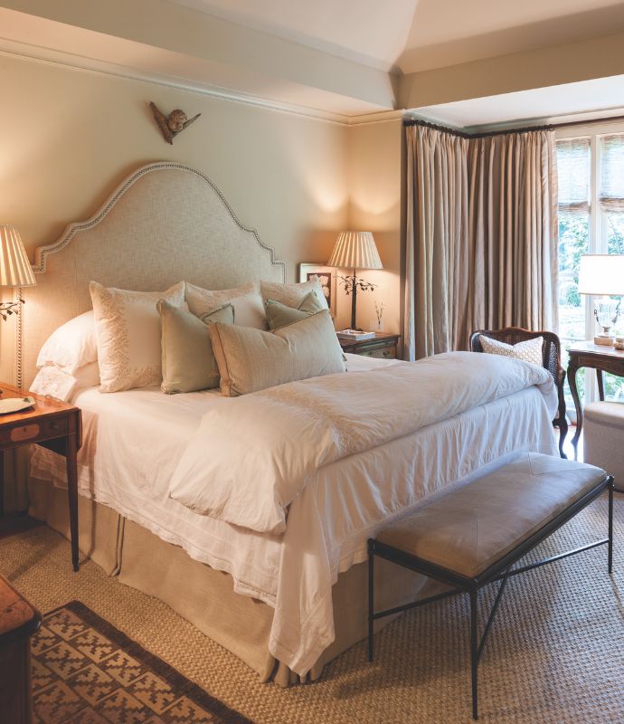
10-11-2024 01:41 PM
I like the colors, but that living (sitting?) room is way too busy. Talk about a long-tailed cat in a room full of rocking chairs. You need a map to just walk around the room. Also, I don't understand why people hang paintings in front of books. Are you not supposed to take down the books? And those volumes look interesting, so what do I do? The bedroom looks restful, but I'm not a fan of fabric headboards.
10-11-2024 01:54 PM
Not to my taste. I hate to critique because I realize someone has worked very hard on all aspects of that project, but the word "drab" first comes to my mind. I'm pretty sure that's not what they were going for lol.
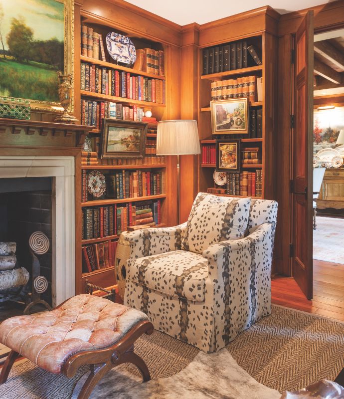
I can't even approve the reading space in the library because I don't want to jump in that chair - those pieces just don't give me any "ahh, comfy" vibes. ![]()
10-11-2024 01:59 PM
I do like the first, paneled library look-- a cozy place to read.
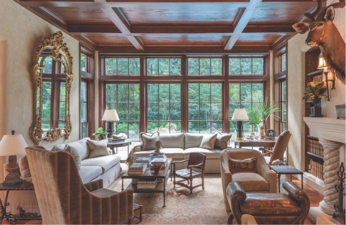
In room 2-- designers love to put up animal heads! I always think it detracts. So many persist in doing it. Remove that, and the room is quite salvageable with a tweak or two.
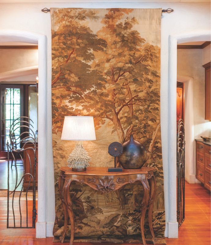
There's an uneasy mix of styles that just doesn't gel for me. In the 3rd image, backed by a dominant old tapestry, trailing on the floor, and then there are sort of 'boho-modern' accessories on a traditional console table in front. I wonder if that is an iron sculpture on the left? Or a gate?
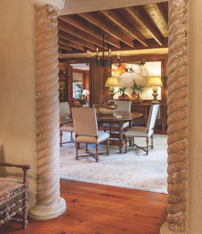
Don't care for the grandiose swirly half-pillars opening on to a rather rustic, wood-ceilinged room; again, the differing styles don't meld well. They should dump those pillars altogether.
10-11-2024 02:11 PM
Interesting. I like the library, and what appears to be a foyer or hallway. I don't care for the living room, dining room or bedroom.
I don't care for the barbaric practice of displaying animal heads on the wall either.
10-11-2024 02:16 PM
The warmth of the library is nice, but I don't like the print on the chair, the ottoman, and the animal rug must go.
Love the windows in the living space, but I need some color. Too many furnishings. The deer head must go.
The dining room and bedroom are ok, but again, I need more color. I don't really like the spiral columns.
JMO
10-11-2024 02:31 PM
Ok, with this one, the Library is ok, nice and cozy but too many patterns for me. The Living room has too much furniture in it, and the animal head on the wall-NO!!!
The Dining Room looks nice, but do not like columns...
the bedroom is ok, but deperately needs some color..
10-11-2024 02:42 PM
To me all the different styles and 'things' are fighting for attention, the dead animal on the wall was the final straw for me, it's not comfortable for me.


Get sneak previews of special offers & upcoming events delivered to your inbox.
*You're signing up to receive QVC promotional email.
Find recent orders, do a return or exchange, create a Wish List & more.


Privacy StatementGeneral Terms of Use
QVC is not responsible for the availability, content, security, policies, or practices of the above referenced third-party linked sites nor liable for statements, claims, opinions, or representations contained therein. QVC's Privacy Statement does not apply to these third-party web sites.
© 1995-2026 QVC, Inc. All rights reserved. | QVC, Q and the Q logo are registered service marks of ER Marks, Inc. 888-345-5788