Stay in Touch
Get sneak previews of special offers & upcoming events delivered to your inbox.
Sign in
04-03-2020 01:09 PM

04-03-2020 01:16 PM
👍
04-03-2020 01:17 PM
Attractive, however, I'd use blue.
04-03-2020 01:18 PM
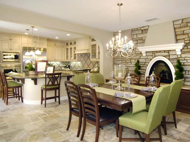
Bar chairs should have been white and table seats all green cloth. It's too busy with chairs the way it is. That's my only complaint.
04-03-2020 01:34 PM - edited 04-03-2020 01:34 PM
Nice clean lines, but I don't like a dining room that looks into the entire kitchen. That's where the dirty pots and pans and the mess of getting dinner on the table is plainly visible.
04-03-2020 02:13 PM
It's beautiful, but I would like more of a separation between the formal dining room and the kitchen. I don't mind a casual eating space in the kitchen, but not a formal DR.
I would also make all the DR chairs match. Love that whole fireplace wall and the kitchen.
04-03-2020 02:49 PM
I love this, it is absolutely gorgeous, however I too would like to see a little separation between the 2 rooms! I know that is really popular right now the whole "Open Concept" but I do still enjoy separate rooms...
This is just lovely though!
04-03-2020 03:03 PM
Very nice but I prefer a different color theme,, something in blue., Aslo I am not a fan of rooms blending in with other rooms, I prefer separation.
04-03-2020 04:18 PM - edited 04-03-2020 06:36 PM
Interesting and quite attractive. Really like the fireplace wall. As much as I like the soothing, muted green, I think I might opt for adding a bit more color.
Get sneak previews of special offers & upcoming events delivered to your inbox.
*You're signing up to receive QVC promotional email.
Find recent orders, do a return or exchange, create a Wish List & more.
Privacy StatementGeneral Terms of Use
QVC is not responsible for the availability, content, security, policies, or practices of the above referenced third-party linked sites nor liable for statements, claims, opinions, or representations contained therein. QVC's Privacy Statement does not apply to these third-party web sites.
© 1995-2026 QVC, Inc. All rights reserved. | QVC, Q and the Q logo are registered service marks of ER Marks, Inc. 888-345-5788