Stay in Touch
Get sneak previews of special offers & upcoming events delivered to your inbox.
Sign in
06-07-2022 07:50 PM - edited 06-08-2022 05:18 AM
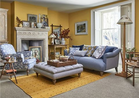
While there are things I like about this room, I don't know if I could live with that wall color again. I had wall paper this color in the 70's to 80's. Either the gold on the floor would have to go or the gold on the wall. What do you think?
06-07-2022 07:54 PM
I especial!y dislike it with the gray. The two colors do nothing for each other. Not only could I not live in this room, I couldn't sit there more than 5 minutes. Awful.
06-07-2022 08:03 PM
That's gray? It's coming up blue on my screen. I don't mind the room and furnishings too much, but the gold walls and rug look out of place to me.
06-07-2022 08:07 PM
@Kachina624 wrote:I especial!y dislike it with the gray. The two colors do nothing for each other. Not only could I not live in this room, I couldn't sit there more than 5 minutes. Awful.
It is jarring to see some colors paired together, this being one instance. This color just screams no to the gold and vide versa. The color Bartlett pear and Blond were big colors in the late 1990s and then in the early 2000, the grays came in and we have been veering toward Russia for a while and it's time to pull back from these dreary colors and get back to some sunshine and lollipops.
06-07-2022 08:08 PM
Gold is seeing a revival especially in fixtures. Gold is a warm color and the decor should be with warm tones, not cool tones. This look is a miss for me since I do not like gray in homes.
06-07-2022 08:19 PM
@jubilant It's God awful. I hate that color for anything -- home decor, clothing, etc.
06-07-2022 08:31 PM
I'd ditch that gold area rug and do one wall with gold...as an accent wall-color and not the whole room.
06-07-2022 08:38 PM
I like gold, but would do a dilute with the paint so that it isn't so intense. I'd skip this rug. A little goes a long way.
06-07-2022 08:40 PM
I really dislike the color gold, but it's not in my "pallete'. I never liked it or orange for that matter.
I remember "Harvest Gold" in the 1960's. Horrors!
I think 14K gold will always be a standard for jewelry from a money standpoint.
06-07-2022 08:55 PM - edited 06-07-2022 08:57 PM
@stevieb wrote:I like gold, but would do a dilute with the paint so that it isn't so intense. I'd skip this rug. A little goes a long way.
The Blond that was so popular back in the 1990s-2000 era was beautiful. I think every decorator had in their homes unless they had Dry Sage. Tone down the gold, go toward a softer mustard and do a rug with 'some" gold in it, but not gold overload. I really HATE the gray color.


Get sneak previews of special offers & upcoming events delivered to your inbox.
*You're signing up to receive QVC promotional email.
Find recent orders, do a return or exchange, create a Wish List & more.


Privacy StatementGeneral Terms of Use
QVC is not responsible for the availability, content, security, policies, or practices of the above referenced third-party linked sites nor liable for statements, claims, opinions, or representations contained therein. QVC's Privacy Statement does not apply to these third-party web sites.
© 1995-2026 QVC, Inc. All rights reserved. | QVC, Q and the Q logo are registered service marks of ER Marks, Inc. 888-345-5788