Stay in Touch
Get sneak previews of special offers & upcoming events delivered to your inbox.
Sign in
12-28-2017 04:30 PM
I’m another one who loves it.
12-28-2017 04:33 PM
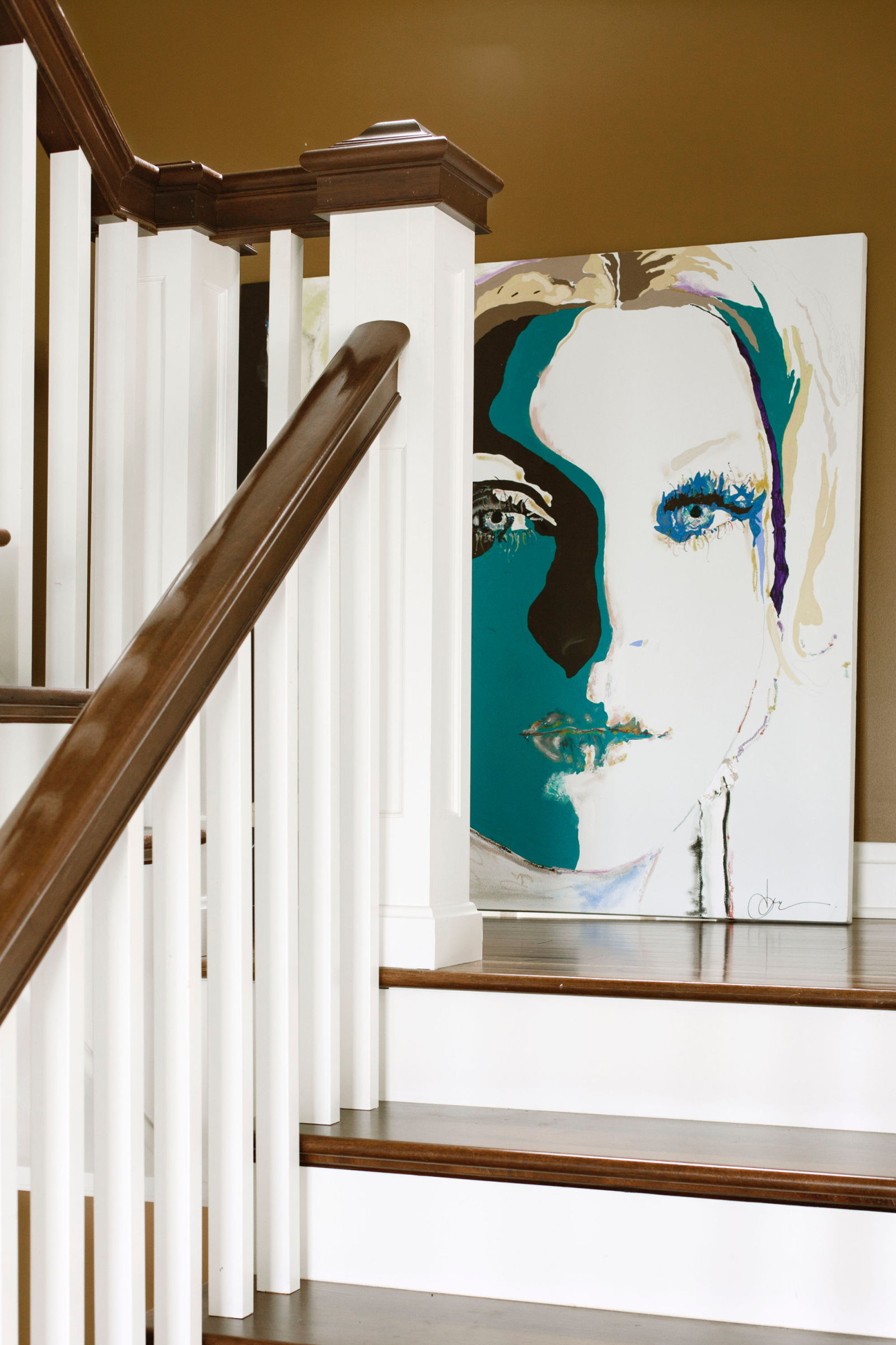
Since the space is neutral in color and design, I think the artwork is perfectly placed. I like it.
12-28-2017 04:46 PM
I love the print.
With the size of the area, anything smaller would look out of proportion. Borders of what was "appropriate" in the past have been shattered. There is no longer a "right" or "wrong" with art and design.
As in everything in design, you go with what is comfortable or interesting to your eye.![]()
12-29-2017 01:22 PM
The size is too big for the space position but the print is fine. Something less vertical and and more horizontal would work.
12-30-2017 03:04 PM
Here is a new one-

12-30-2017 03:15 PM
I love this one, too. I want to look up some of those book titles, and I really like the chest of drawers.
12-30-2017 03:56 PM
First Room - Picture too big for space - maybe a collage of smaller prints
Second Room - I like the way the pictures were hung - unusual. The way the under the stairs space was done is also very nice.
12-30-2017 04:04 PM
Too big.
12-30-2017 07:53 PM
12-31-2017 11:13 AM


Get sneak previews of special offers & upcoming events delivered to your inbox.
*You're signing up to receive QVC promotional email.
Find recent orders, do a return or exchange, create a Wish List & more.


Privacy StatementGeneral Terms of Use
QVC is not responsible for the availability, content, security, policies, or practices of the above referenced third-party linked sites nor liable for statements, claims, opinions, or representations contained therein. QVC's Privacy Statement does not apply to these third-party web sites.
© 1995-2025 QVC, Inc. All rights reserved. | QVC, Q and the Q logo are registered service marks of ER Marks, Inc. 888-345-5788