Stay in Touch
Get sneak previews of special offers & upcoming events delivered to your inbox.
Sign in
01-30-2019 07:25 PM
@lolakimono wrote:
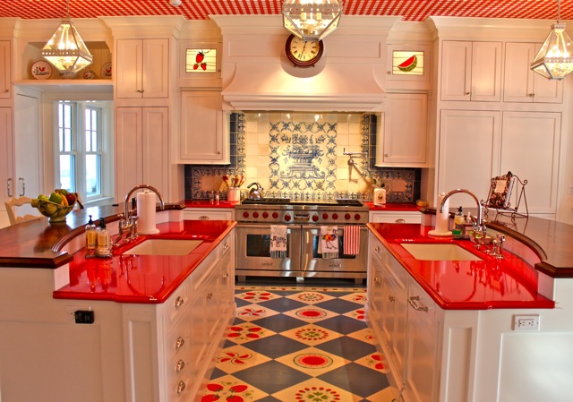
@Scorpio1971 wrote:Any chance of posting pic of the opposite side of kitchen? Ty! 😊
Here is what I could find for you.
Thank you for posting! I thought there would have been more! I love this view of it, as well as all the other close ups you posted! Identical islands give plenty of workspace and the brown wood island tops really help set off the workspace at the sinks from the sitting/eating areas. So bright & cheerful! Thank you again!
01-30-2019 08:09 PM
From what I can see, the kitchen layout is great; exactly what I like. Love the ceiling and the red countertops. I dislike the backsplash and floor tiles because of the blue - - I would prefer more white tile. I also do not like the plaid wallpaper and curtains in the next room.
01-30-2019 08:58 PM - edited 01-30-2019 08:59 PM
@Scorpio1971 wrote:
@lolakimono wrote:
@Scorpio1971 wrote:Any chance of posting pic of the opposite side of kitchen? Ty! 😊
Here is what I could find for you.
Thank you for posting! I thought there would have been more! I love this view of it, as well as all the other close ups you posted! Identical islands give plenty of workspace and the brown wood island tops really help set off the workspace at the sinks from the sitting/eating areas. So bright & cheerful! Thank you again!
@lolakimono I don't like it any more. I had it pictured as a small galley kitchen in a quaint, historic, upscale neighborhood and now that I see it is in a McMansion, I am no longer enchnated by it. The mystique abandoned with a twin side of the kitchen. Picture me sad.
01-30-2019 08:59 PM
No -- too busy and it doesn't seem to have natural light coming in.
01-30-2019 10:43 PM
I think I like it. I would change the back splash behind the stove. I like the shade of red on counters etc. It's different and a nice change , but it might get old fast.
01-30-2019 11:06 PM
I feel happy looking at this cheerful kitchen and see many things I like. I really like the swags with the cherries and the patterned floor. Like the plaid curtains in the dining room. The drawback for me is too much of the red. The countertops in the neutral color that is in the floor and then use some red accent pieces to add the red color instead. I like the look of the red countertops but I think I would tire of them. Maybe if the ceiling was not red and white gingham but was the plaid to match the curtains it would tone down the red and then I would like the red counter tops.
Here I am changing the room as if I was going to be mine! I like it as it is just to look at but if I had to live with it over time a few things would need toned down some.
01-31-2019 03:12 PM
Oh my!!! Too many patterns going on here.
01-31-2019 05:28 PM
Too many patterns, too busy between the ceiling, floors, and ceramic tile behind the stove just too much!.
01-31-2019 08:52 PM
NOPE
Although the floor tiles are eye-catchy looking.
02-01-2019 01:05 AM
The red and the lighting give a very nice and cozy appeal. However, it's not for me. The floor tiles and the ceiling are a bit too much. Maybe I could manage if at least the ceiling was changed to a normal plain one.


Get sneak previews of special offers & upcoming events delivered to your inbox.
*You're signing up to receive QVC promotional email.
Find recent orders, do a return or exchange, create a Wish List & more.


Privacy StatementGeneral Terms of Use
QVC is not responsible for the availability, content, security, policies, or practices of the above referenced third-party linked sites nor liable for statements, claims, opinions, or representations contained therein. QVC's Privacy Statement does not apply to these third-party web sites.
© 1995-2026 QVC, Inc. All rights reserved. | QVC, Q and the Q logo are registered service marks of ER Marks, Inc. 888-345-5788